


Hi folks!
Some of you surfing around yesterday might have stumbled upon what might be the US packfront. We just wanted to drop a note to everyone confirming that the below, is indeed, the US packfront for Heavy Rain:
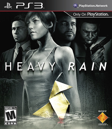
We’re also able to confirm Heavy Rain‘s final ESRB rating has come in at a strong M for Blood, Intense Violence, Nudity, Sexual Content, Strong Language and Use of Drugs. And for those of you who have asked, the content is exactly the same as what’s being released in all our territories, so you’ll get to enjoy it exactly as Quantic Dream intended.
We’ll have much more in the coming days as we get closer to launch, so keep an eye out on the Blog for more information on one of PlayStation’s hottest titles of 2010!
It’s a little bit better than the firmware updates we get. Having 4 guys on the cover is kinda of weird.
Provide a reversible cover! Not everyone has access to a super printer. The US box art is horrendous for a couple of reasons. The first being the exclusion of the Quantic Dream logo. The second being the inclusion of the skewed and completely unrealistic looking wave/puddle underneath the ugly textured origami. I would have shifted the characters down. Removed the wave/puddle thing. Slapped on the Quantic Dream logo on the bottom-center and gotten rid of the Playstation Network text/logo from the top right corner.
Wait – so first it was confirmed that the Japanese version would be censored, now this seems to indicate it won’t.
Which is it?
Give me a break. The European box art IS much better. It has a more realistic feel to it and it doesn’t look like a photoshop production. But it is going to keep people from buying the game? Not unless you’re idiotic. It’s going to be an AMAZING game, despite what the cover looks like. Buy the game for the content, not the cover. However, I find our (American) version to be all right, just stereotypical and unoriginal. The Europeans is at least WAY more realistic, has that authentic blood-look, the battle look of the origami being folded by an actual person, etc. I like it. I like there’s more. Regardless, it’s going to be one amazing game that EACH PS3 owner MUST own. :)
Will there be a pre-release demo for NA?
Since there will be for Europe;
https://blog.eu.playstation.com/2010/01/08/heavy-rain-approaching/#comment-49665
Oh, and already preordered. :)
day 1 baby
Man, I don’t know what’s wrong with people. In my opinion, the American box art looks waaay better than the international version. While it may look simple and cleaner, the colors are a drag. The American version just feels better. Much more adult to me. It speaks more, i think. OK, a little rambly, but the American version is awesome!
Since the PS3 cases are a slight transparency, why not just put the Origami shape visible when you open the case? Or just have a double-side print too.
nice – dontthink ill get this gaMe though
Is there going to be a demo-version of the game?
sexxxaye!!!
Being “better” is a matter of opinion with art. It also has to be viewed from a marketing perspective as someone mentioned.
Either way, this is going to be a great exclusive and an amazing game.
Why must all NA box art look the same? The EU cover has a creepy, Silent Hill vibe about it. The NA cover looks like every other game cover that’s currently in the stores. It will just blend in with everything else and get lost on the shelf, while that simple origami cover would have jumped out at people.
Not a bad cover but I prefer the European one… I feel that they just want to put the girl on the cover for the 18-35 testosterone man instead of pushing the mystery aspect of the game !
Yes, Please REVERSIBLE COVER ART!
My printer won’t live up to the real thing, and some place where I could get a great professional looking print, (FedEx/Kinkos and the like) won’t let me print copyrighted content.
damn it I miss the tournament sign up I was very busy yesterday and I couldn’t get on to check the blog hell I was so busy I couldn’t even get on my pc
opps wrong blog page this was meant for the blog about mag
I like this, but I like the EU one more.
PAL version was so simple and intriguing. ‘What is this creepy cover’ then I’ll pick it up and read about it on the back, right? This makes me want to let it lay there on the shelf even though I know its a good game. It’s sad Sony or whoever feels Americans need dumbed down art. This is really a title exclusive? This is what you want representing a Sony brand? Leave it classy or I might confuse it with a CSI game.
Thank you for the UK Box Art PDF option Cristian,
Not sure why anyone thought the U.S. cover needed to be different or so busy with photoshop layers..
I’ll be looking forward to the printable cover thanks.
European box art leaves more to the imagination, as always.
i rarely like american boxart, it’s all politically correct (very dull, trying to offend nobody)
i liked Sony’s first European playstation ads, cited as being only racist in America (they weren’t racist anywhere else, because the rest of the world are all a part of HUMAN RACE but Americans are all part of the black/white/yellow/brown/purple/green races…lol…)
fpc,
I personally like it, the box art looks like a movie poster, and i really like that, besides isnt this game suppose to be a mix between game and movie experience? is time for you guy to understand that the game industry is changing and with that the way they create art box too, looking forward to this game, great job QD and Sony for bringing new experiences to gamers like me. 2010 is the year of the PS3
I really prefer the EU Box art. It’s much more subtle and sophisticated, and does a good job of hinting at the game’s plot without seeming too over the top. The US Box art showing the main characters seems really self important and less intriguing, and really says nothing about the game.
Ummm…I had a comment on the first page moderated and I can’t for the life of me discern why (no profanity, nothing negative directed at another user OR Sony, no links to anything). It’s not really a big deal, but I’m curious why my comment was pulled. Is there somewhere I can find out? Thanks to anyone who could help.
This packshot Looks really Great, 10000 Times better than the Euro packshot
Excellent box.
It’s not horrible but after seeing the much improved EU boxart I don’t understand why this box has to look the way it does.
I think American videogame marketing companies underestimate the North American market of videogame players. We are actually very intelligent people and appreciate more artsy, stylized, boxart. Especially when it comes to Mature-rated games that are designed for a more sophisticated audience as Heavy Rain is.
i’d like a demo please!
I know it’s probably too late for that, but I have to say: this box art looks terrible, and is way too busy… and the printable EU box art solution isn’t the answer, because this is what people will see on the store shelf!
Reversible Cover Box Art = Great Idea. That way we can choose which side we want. If not, offering an alternate cover art edition would be nice. I’d be willing to pay an extra $10 just for the EU box art over the US.
THe US Box art looks fine. It would be cool to have a double sided insert with a different cover though.
I like the ta-tas . . . I mean US artwork. heh
On second thought, maybe the US box art is marketing genius. People will naturally assume that the lack of originality and inspiration in the cover art will carry over into the actual game. Way to psyche out the consumer with managed expectations!
My chemistry teacher looks exactly like the second from the right. Like, so similar it’s scary. Anyway, I can’t believe I forgot the character’s name: Ethan Mars or something like that. Been following this since “The Casting” and I’m a huge fan of Indigo Prophecy! Can’t wait!
P.S. – Will there be a demo?
P.P.S. – Will we be seeing more from Quantic Dream in the future?
Any word on a demo I’m kind of confused on what it’s about.
Looks cool! reminds me of the Sega days 1999-DC anyone remember those days old school right here! demo please Sony!…WE NEED A DEMO SCEA SO PLEASE PROVIDE THAT CHEERS!
I was referring to the Dream Cast Days Shenmue! lol..SEGA!!!!
Ok soo people complain that the US cover has the characters and many like the EU version minus the characters?
Heck if you don’t like the characters in the cover mind as well don’t play the game. I will
Wow. Terrible, terrible, terrible box art. The international art is simple, mysterious and aesthetically pleasing, and for the US they go with the usual “CHARACTERS STANDING LOOKING TO DISTANCE ONE WITH BOOBS” DVD cover. :(
Just a really quick question!
Does this game support full 1080p? If so, I’m a Day-1 buyer for sure! Thanks!
The US box art is so incredibly UNimaginative it’s not even funny. Why do you guys work so hard NOT to stand out from the rest.
The PAL boxart is symbolic and mysterious, makes me want to know more about the game!
This, this is just plain and boring and so very typical.
FAIL.
I got to hand it to you guys though, at least I’ll be able to print out the real boxart! Day 1 purchase for me.
The boxart for this interactive movie looks extremely bland. The EU cover is much better.
Wow that’s horrible.
It’d be better if you make this the printable one, honestly.
The original cover is much better. I hope I can get my hands on it.
I’m really looking forward to the game, but this cover artwork looks horrible! The entire cover is full of dull-looking gray characters, with no life to them at all. The European artwork looks MUCH better, I don’t know who figured this artwork would be better for the US market?!
And why not put the “Only on Playstation in the top-right corner inside the border, and skip the “Playstation Network” logo, I don’t know what that’s supposed to tell anyone??
Oh, and include dual reversible covers, or just use the EU artwork standard everywhere!!
I am excited about this box art. It has to be some of the best art I have seen grace a PS3 cover to date. It depicts the general mood of the game to me from what I have gathered and have been anticipating. I would be sorely disappointed if this cover wasn’t going to be the official U.S. cover.
And, seriously, who would be disappointed to have these badass lookin’ characters on the front cover anyway. Just look at ’em. Quit whining and be happy that such an awesome game is coming out soon.
Please, come back to the Europe cover. This one is terrible!!!
I find this cover art not artistic at all, very typical US version which is uglier than the other versions, lack of imagination and has to spell out “everything” afraid buyers won’t be attracted to just the origami bird (the European version). Just like the MGS4 cover, the JP version has just Old Snake on the cover, the US version had to put the game name over Snake’s face, destoring the design and mood of the cover, again, afraid buyers won’t recognize Snake.
Sony America, we will print out the EU cover and replace this ugly US version for sure!
I don’t like this box art at all. I like the European version better.