


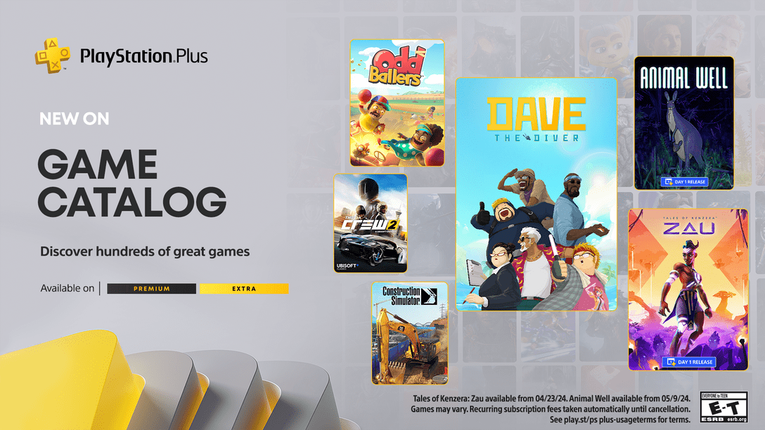
Notice anything different?
Today, we’re quite ecstatic to unveil the new look of the PlayStation.Blog. As the site marches towards its 4th anniversary in June, the patchwork, add-on look of these pages began to resemble the Weasley house. Also, we were tired of being unfavorably compared to our more attractive, cosmopolitan European sister site.
Unlike commercial sites, we didn’t redesign to serve you more ads, or because we have an in-house art staff that we have to justify. We redesigned the PlayStation.Blog with your requests in mind. How do we know what you’re looking for? You’ve been voting with your clicks.
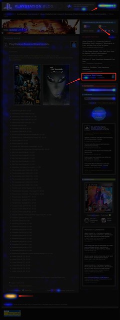
Over the past year, we’ve been analyzing where readers click on the site and, as you can see, items like PlayStation Store update posts and recent stories light up like a Christmas tree. If you only decorate your tree with white lights, that is. When we coupled this info with traffic patterns, Google searches, and other data, it was pretty clear what types of things Blog readers like yourself are looking for when you visit. This redesign addresses these needs.
So we’ve added prominent, permanent links to PlayStation Plus and PlayStation Home content. We’ve overhauled the search box with autocomplete. Our biggest recent releases now “live” at the top right of the site. And huge news won’t get pushed down the page nearly as quickly as it used to.
Conversely, with the old design many things weren’t as easy to find as they should have been. You’ll now find it easier to give feedback on posts via Twitter and Facebook (both of which had a fraction of their current userbase when we first launched the site). Related content will appear at the bottom of a post, and a string of features can be found in a scrolling “red box” belt right in the middle of the homepage.
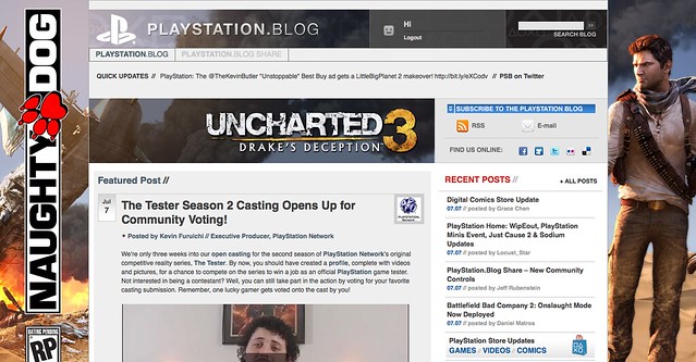
We also know that the average reader owns a wider, higher-resolution monitor than when we first launched in 2007, and so we’re taking advantage of that additional real estate, and you can expect more and better takeovers of the site, like we did with UNCHARTED 3’s launch.
Now, we realize that this new design will take some getting used to, and some of you will probably hate it outright – at least at first. Many of you said as much when we inverted the color palette from black to white last year, though those complaints died out very quickly as we all adjusted.
Still, for those who really loved the old site, if you look closely, you’ll notice the things that *didn’t* change. The font, colors, and sizes are all the same. Comment replies remain an attention-grabbing red. Of course, the PlayStation news content you visit us to view will all still be here – you just won’t have to look as hard.
Over the course of the redesign process, we began to compare the new site to [lady with the hat]. Even if you don’t care for the flashy new hat, the old girl you know and love is still underneath.
Please let us know what you think. As always, we’ll be reading.
Sincerely,
Jeff, Sid, and Rey
Your PlayStation.Blog team

It took me a couple of minutes to get used to the new blog, but I have to say I do like it. Thanks for always keeping things updated & keeping things fresh.
I’d much rather see a list of stories, or more of an organized format of them on the homepage, rather than having them scattered around in boxes. Other than that I love the new looks and colors.
any chance of being able to get/send messages via PSN through the PSN Blog here since we can sign in to comment and access the store?
At first glance I was like, “Cool.” Then I was, “Too complicated, not cool.” But after about 1 minute just playing around and navigating the new site, I actually like it. It’s not as complicated as it looked and I like the new look.
I don’t like the new design. This doesn’t feel like a blog anymore. More features and bigger pictures is not always better, I liked the last one because it was simple, as it was easy to scroll through and served its purpose well.
Looks great Jeff! It was a pleasant surprise and it looks much more attractive and professional. I’m proud of you guys, keep up the great work!
I like it. Looks good. For those who say its too much, its the reason why playstation is so behind. How bout the moblie site, does it look this good, any improvements? Now go fix the ps3.
looks good, very slick
A few suggestions. Be able to message or chat with friends on ps3 from here and have the top 5 suggestions in blog.share finally be put in ps3. Thank you.
Wow! The new blog looks fantastic! Wow!
Love it, after seeing it I quickly looked for a post about it to say what a nice job you’ve done withe the blog.
One place i have concern is when i went to log on it took me to an old window, halted the browser for a second coming in and out of the old login window. Might just be a small bug someone missed.
Now can we please get an updated PS3 Browser?
DEAR GOD THANK YOU!! You not only stepped your game up to match your EU sibling (…now maybe you all can do up your PSN ID trophycards up to their standards as well *hint, hint*), but you DARKENED this freakin’ site, too! My eyes love you for this…
Because, you know, not ALL of us got accustomed to it we simply stop coming by as often (just like w/ community.playstation.com, it wasn’t tolerable until some made a Stylish extension mod to darken that back). I know I surely did. My eyes would’ve bled out from all the whitewall. The rest of the site don’t look so bad either…lovin’ the black & red (2 of fav color combs) color scheme–makes it look pretty damn smexy, lol Nice to see you guys bring it back. ^_^
I can already tell you I’ve gotten much adjusted to this style much quicker than the last. Now you guess need to make it so open this and community.playstation.come forums can run smoothly in the PS3 browser. Well hell, even better, why don’t you guys set someone to work on that for the next update (something that makes looking/surfing the Net easier & prettier), please?? <_<
I like the overall changes; however, there is one thing that I think is a bit redundant. You list all of the main blogs in a scrolldown slider, but then you list all of these same blog stories underneath everything too. It just seems too cluttered with all the same information. It’s like repeating yourself twice. Maybe you can use that space at the bottom for something else.
Looks great. When is the number one request on Playstation Blog Share going to be implemented? :)
I’m kinda feeling this… i believe it will grow on me. Had a shock value to it when I first saw it, I was confused lol
@86, SmooshyKing–I agree w/ your point as well. I love the look of once you actually click on a blog article; yet the initial start/home page is cluttered, overdone, mess. I had to hurry up and click on this link before my eyes got overloaded.
It’s a little too over-powering when you first jump on this site….scale back some. Just my 2 shiny pennies, though…
I like the new blog. However still watching for the moblie phone app too. I’ll just wait for it like everyone else. Meanwhile I’ll enjoy the show.
the ability to send msgs through blog …. BAD IDEA . giving anybody and everybody who simply creates an account without even purchasing a ps3 the ability to send spam/ unsolicited messages ?? imagine turning on your ps3 a finding you have messages telling you that you can get tamoxifil for only 19.99 . on a daily basis … yeah sure theres a reporting system . but what makes you think they can or want to deal with that sort of hassle ???
What?!? No CROSS-GAME-CHAT?!?!?! This redesign sukz!!!!
;-)
Since you’re redesigning how about a xmb overhaul?
Im bored already it doesnt feel like a gaming system.
Thank god ngp isnt going to have it
Well jeff I think i like it, at first it was weird because im not used to it , but I like how everything is placed and it does look better.
Oh man, I love this new layout. I kind of wish that we could, you know, respond to other users’ comments. Either way, SURE BEATS GAWKER’S NEW LAYOUT! 8D
looks really good but I’ll have to see whether it’s still ps3 friendly to view And if it’ll be ps3 friendly to use and post on again like 2 years ago
the main complaint about the blog since 2008 ( and the forums and blog.share ) is it’s not usable on a ps3 browser
I normally hate redesigns, facebook goes through multiple terrible revisions a year. However I will say I really do like this one, great stuff art team.
Not a fan, the top looks way too cluttered.
I was pleasantly surprised when I now just came to this site to see a new, and improved, website. Keep up the great work guys!
I like it. It looks very cool.
Went to the psblog first time today and was shocked to see the page change. I like it! looks more attractive and professional now! keep up the great work Sony!
Cluttered. Quite cluttered. But there is no use criticizing/complaining, because I highly doubt you guys will change anything to make it less cluttered.
Its actually a bit cluttered..
The scroller bar on the right is actually not even needed since all those blog posts are actually right below the scroller.
Its just a bit hard to tell what to look at.
So take out the scroller and extend the banners on the left of it. That should be a good start.
Pretty much below everything you see when you open the main page is good! The site is more attractive then before, but it still needs a bit of work.
The dark gray background really boosts the legibility for me, and I really like how “cleaned up” it feels, without losing anything.
yea oh yea.. can it make me a sandwich now? I’d really like that!!
I will say that it does load a bit faster for me, so that’s a plus.
HEY i like it, looks 10 times better. Don’t know why anyone would hate it,
As long as you keep the blog updated and i can post back I’m happy :)
I love it. More sleeker and more modern. Somewhat similar to Kotaku’s update but I find PS Blog’s design way way better.
Anyway I can make my layout blue like the one in the picture here?
http://www.flickr.com/photos/playstationblog/5524864941/sizes/o/in/photostream/
Would make it 10 times better for me, personally. Looks ard.
Oh no, I prefer the old style. I appreciate the effort, but there’s too much going on guys. Kotaku did a similar change recently, it went from a clean website, to a cluster…..you know the rest. Can you guys combine the old and new look? Thanks.
I like the article view since it’s a much simpler format than the front page. The front page is definitely jarring for me with too much going on. I didn’t notice the articles until I really looked for them.
The reason the euro blog gets more praise is simply for the sleek exterior. I believe the underlying facets were still the same. I still prefer the euro blog design but of course the content is irrelevant to me.
This is much better it looks alomost resemble to europe ps blog section but better its easy to navigate and its very accessible
I have to agree with the “too many of the same thing” ideas. There really is too much repetition. I’m hoping that’ll clear up as more posts are made available.
However, Share looks out of place and unpolished now. The sorting is currently broken too(Just “Ideas in Action” is visible) and there’s no new sorting options
Get on it! (But take a break-overall, good work)
Looks great! Now update the XMB UI with something sleek and we are all set! :-)
Thanks for the cool Birthday present, .Blog. I’ll use it every day.
Awesome look very clean and manageable. Can’t wait to see whats next.
Nice, BUT I still can’t log in from my PlayStation 3. I could log in from my PS3 years ago, but for some reason it stopped working and this new blog update doesn’t fix that. When you update the PlayStation website and the blog please always try to log in from your PS3 and make sure it works. Also, youtube.com doesn’t work as smoothly as it used to before. Now I can’t choose video dates. Just wanted to let you know that and I hope you get to read my comment.
It looks way too clutter. When a redesign slows down my ability to quickly peruse a web page, that is not a good thing. Did you all learn nothing from the gawker sites screw up?
it will take some getting used to but i like the new look. my favorite thing about the old blog though was being able to go through all the posts one by one so that i knew i was not missing anything.
I don’t really like it, here’s why..
The old format was like Facebook, Clean, straight forward, and everything was just easier to read.
The new format… is like the newer version of Myspace… seems like it’s trying to hard to be fancy.
When Myspace switched to the new look.. i switched to Facebook..
Totally not feeling the new look. :/ Sorry.
I can respect how much work you guy put into it though. :)
Very sexy
Like many others have mentioned, it took a bit of getting used to but I definitely am liking it better. After spending a few minutes just looking around the front page it makes a lot more sense and the most important stuff is right there where you need it. Great work on this!
Sweet Jesus, this is worse than Gawker’s design! Thumbs DOWN!