
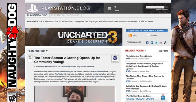
Today, we’re quite ecstatic to unveil the new look of the PlayStation.Blog. As the site marches towards its 4th anniversary in June, the patchwork, add-on look of these pages began to resemble the Weasley house. Also, we were tired of being unfavorably compared to our more attractive, cosmopolitan European sister site.
Unlike commercial sites, we didn’t redesign to serve you more ads, or because we have an in-house art staff that we have to justify. We redesigned the PlayStation.Blog with your requests in mind. How do we know what you’re looking for? You’ve been voting with your clicks.
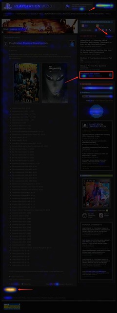
Over the past year, we’ve been analyzing where readers click on the site and, as you can see, items like PlayStation Store update posts and recent stories light up like a Christmas tree. If you only decorate your tree with white lights, that is. When we coupled this info with traffic patterns, Google searches, and other data, it was pretty clear what types of things Blog readers like yourself are looking for when you visit. This redesign addresses these needs.
So we’ve added prominent, permanent links to PlayStation Plus and PlayStation Home content. We’ve overhauled the search box with autocomplete. Our biggest recent releases now “live” at the top right of the site. And huge news won’t get pushed down the page nearly as quickly as it used to.
Conversely, with the old design many things weren’t as easy to find as they should have been. You’ll now find it easier to give feedback on posts via Twitter and Facebook (both of which had a fraction of their current userbase when we first launched the site). Related content will appear at the bottom of a post, and a string of features can be found in a scrolling “red box” belt right in the middle of the homepage.
We also know that the average reader owns a wider, higher-resolution monitor than when we first launched in 2007, and so we’re taking advantage of that additional real estate, and you can expect more and better takeovers of the site, like we did with UNCHARTED 3’s launch.
Now, we realize that this new design will take some getting used to, and some of you will probably hate it outright – at least at first. Many of you said as much when we inverted the color palette from black to white last year, though those complaints died out very quickly as we all adjusted.
Still, for those who really loved the old site, if you look closely, you’ll notice the things that *didn’t* change. The font, colors, and sizes are all the same. Comment replies remain an attention-grabbing red. Of course, the PlayStation news content you visit us to view will all still be here – you just won’t have to look as hard.
Over the course of the redesign process, we began to compare the new site to [lady with the hat]. Even if you don’t care for the flashy new hat, the old girl you know and love is still underneath.
Please let us know what you think. As always, we’ll be reading.
Sincerely,
Jeff, Sid, and Rey
Your PlayStation.Blog team


OMG, I LOVE IT. I hated the old one as it was not user friendly. This seems not so busy and my eyes seem to relax more! Keep it up!
Way too much repeating. We dont need the little boxes at the top showing the same thing as the big boxes at the bottom.
Take away all the boxes at the top and leaving all the big boxes at the bottom that show the articles with part of the story.
Too much clutter is not always a good thing. sometimes less is more, and more is less. in this case more is less lol
if this post makes any sense to anyone lol
i like this design even better but theres just too much of the same stuff, theres already news on the top and then the same news again on the side to scroll, and then again on the bottom?. oh and still hate the login part. hate the different web page just to log in, then redirect back.
I’m very much digging this new PlayStation Blog layout!! 5/5 STARS!!!
I think I like it, need a few visits to be sure of that first. Color scheme is nice though!
My big question is, whats the news on an Android (and I guess iPhone) app for the PS Blog? Lately Ive been more likely to read news on my Android than the computer. Currently, its very tricky…nearly impossible…to even log into a PSN account over an android and an app would be great! I remember reading several months ago that one was in the works. Is it any closer to being reality yet?
this is AWESOME!!
I was worried you’d make it Arsenal themed but then I remembered their season has tanked in the past 2 weeks.
About time, I’d say. :) Change is great sometimes. This is one of those times. Hopefully we will see similar changes in the community/forums? :/ *Hopeful*
Yea this is nice, its busy but its simple so thats good, i like to have alot on one page, like you said you guys made use of he 16×9 ratio and that i thank u for… now im happy too because it looks even better than the eu blog to me.. i still couldnt sign via PS3 browser but im sure its the ps3.. i love the NGP tab, i need my daily look at my new baby lol.. great job my sony bravia HDTV/PC monitor/etc/etc lovin’ the colors!! Thnak Jeff, Sid and Rey!
Don’t like the redesign. way too cluttered and narrow. the old design was easy to look at even if it was dark. :\
WoW! Awesome the new desing! Congratulations!
Looks pretty good! Im actually pretty impressed! Great job guys!
I liked! Looks very sweet!
i like it but could u make the maenu load faster on black ops bcoz it takes ages 2 load and make party chat like Xbox has :P even tho i HATE Xbox
Thanks for replying Jeff. I just went through a nightmare with customer support for 1 hour game trials. But there are zero means for me to be able to share the expirence or offer suggestions to fix it. Everything is limited in length. So short and simple. Just know that if something goes wrong with a 1 hour trial, you guys have no means to help someone due to playstation network limitations. Upsetting for a paid service. Really wish I could have enjoyed Modnation Racers and made a purchase!
The new design is great! Can we have a PS blog app for the PS3? That would be awesome
loving the new look ! I found it difficult before to find posts just for PS+, new releases etc. now its so much simpler. If I would give a suggestion.. wish you guys could implement some way of us being able to check if our friends are online and maybe cross msg them? so I can msg them through the if they were playing or surfing the forums on the official PS site. Help enrich the community and plan group sessions!:)
I like the comment box, its neat.
Now change the xmb for the PS3, please =]? Its been like 6 year, its time for a change.
and and if someone replies to our posts, and maybe a button wherein we can see all the official responses within the post? instead of us scrolling through a bunch of comments to find a red post :P
Pretty nice look. I like it .
#76.. theres one already. I have it on my Ipod touch.. or atleast I think it’s the one you’re talking about. I’m able to view my trophies as well as others, post on the blog, vew news on games, and etc. Search the app store for PlayStation. It should say official.
first impressions:
– it feels small; I need to scroll up & down a lot
– for voting; the place to vote doesn’t make sense to me; if the story is long I will have to scroll up to vote; wouldn’t be surprised if you loose votes because of the placement; also you don’t want us to vote on the first paragraph only <- which may happen now
I do think the layout (colors , cleanness , fonts ) fits very well! It just feels a bit small ;-) I'll get used to that!
The landing page is a succinct and nearly perfect lesson in how NOT to design a web-page. Massive redundancy. Dozens of competing focal points. Arrow “buttons” that, when clicked, provided even further redundancy by just showing the same content that is already peppered throughout the page.
WOW.
At first i was completely against it.. but knowing how it was determined and changed.. i think it makes sense. I will do my best to get used to this.
Excellent job Jeff. You guys rule and the new blog is gorgeous.
Looks cool, changes are always a good thing! =)
oh wait.. you can see replies.. whoops! but I suppose if it could be filtered just to show replied posts :P
Hey Jeff.
What are you doing right now?
You know, other than knitting PSP minis with your wife lol
BEYOND!
looks very nice, it looks so much better then it did and more retro, great job Sony
Overall, I think this is an effective redesign. It was definitely done for the correct reasons: to add usability and address customer requests. It’s going to take some getting used to, but I think I can see myself actively liking the new design in the not-too-distant future. One thing I would suggest: the new design makes for a great front page, but some people like having the vanilla story feed, especially for mobile browsing. An option for that might be useful. Or is there one that I missed?
I like it but I also think you should hire my buddy Hellman (comment #37), he’s a graphic artist. Just saying.
The new look is off the hook! Lol. Seriously! Thanks for the redesign. Not only does it look better but we get to see a lot more stories without having to click the next page. Some people might not like it at first (most of them are afraid of change) but they will get use to it. I did a little analyzing to see how the layout is actually setup and it is thoughtfully done. Very good job guys/gals and thanks again.
Looks really good but why did you guys get rid of the ratings?
Looking good. The old white background was a bit dull for my tastes.
@Jeff is it true there isn’t going to be a store update on Tues due to the earthquake? Since I hear Sony is shuttin down its resources to help out?
Can we get a ps plus symbol next to our name?
Me likey. Less is more!!!
This is something that definitely has to grow on me, since I come on the blog at least once a day.
Looks great, a bit too much content on main page though, but i think just takes time to get used to.
Oh and now it just needs an official podcast among those right side widgets :)
Not bad!
@131 the ratings are still there, they got moved next to the share buttons (Twitter and Facebook)
JEFF! You should make when we click on someone’s psn name from their comment, it leads to their psn page(where their trophies are). If it’s like that, it’s not working right now.
Hey Jeff would it be possible to get a proper reply system? I know the big wigs can reply with their big fancy red but it would be nice if we could reply to comments to, to answer or respond to someone without flooding the blog with a ton more comments. Maybe a thread like system similar to a forum.
Just a thought. It beats going @XXX lol
New site looks AMAZING!!! Very colorful and vibrant. A lot better than the boring old one :P
WOW!! WOW!!! WOW!!!! WOW!!!!!
I definitely like this look seems like there is so much more to do. I am definitely taken aback by this it will take some getting used to but by no means will that take a long time. This will definitely make my days at work better thanks guys.
P.S. Did I say WOW! cause I am serious I really mean WOW!!! like HOT DAMN!! WOW!!!!!
Ray AKA The PS Blog Stalker
I like it so far. There is a lot of black though. But least the text areas are white and easy to read and make out.
Ok this will take some time to get used to, i dont dislike it or like it yet. Will have to play around with it for a bit to decide one way or the other. I do however see somethings i instantly like, i can choose the platform i want to look at with a click and not have to look at the rest till im ready to, which is handy. I dont care for the “buttons” beside the PS3, NGP, PS2, PSP though, they look amateurish. I really like the added colour too, its nice to see that stuff.
I wll post my other likes and dislikes later. So far though it seems like tis not taking away, which for a revamp is always a good thing!
The site looks prettier BUT it feels harder to tell what the stories are, whats newer, and i feel like im going to be missing things. its harder to focus on the actual stories/posts
Kill it with Fire!
Seriously, me no likey. I can see why you would want more blog posts on the first page, but this just doesn’t work. I think it’s the multiple columns that bothers me the most. Page honestly looks like a cluttered mess to me.
-Krae
Initial reaction was mixed like it always is when something familiar changes. Think it’s mostly just human nature. After spending some time looking over the site though, it really is a lot more user friendly. Still have more stuff to explore, but so far I am loving the redesign.
Still my number 1 site to go to for gaming related news especially when it comes to anything Sony related!