


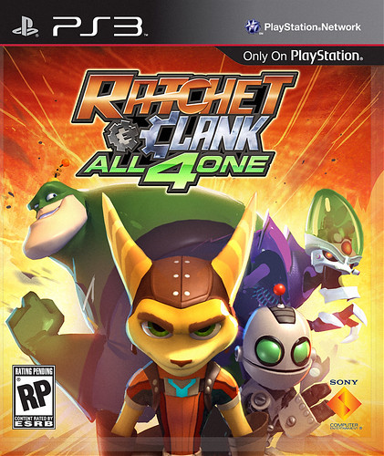
With the clock ticking down to the release of Ratchet & Clank: All 4 One (October 18th!), I wanted to share some insight into an arcane corner of the video game industry: How the box art is made. But first, I’m happy to confirm that the final version of Ratchet & Clank: All 4 One will mark the continuation of a recent PlayStation tradition started with Insomniac’s Resistance 3 — reversible box art! The piece — illustrated by Insomniac’s Greg Baldwin, with back cover concept art from Dave Guertin, began its life as an April Fool’s Day PlayStation.Blog post from Captain Qwark. Behold the secret inner box art that we’ve been chuckling over for the last few weeks.
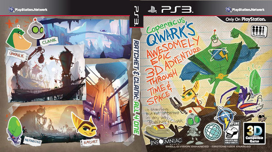
Finally: Captain Qwark gets his moment of glory! Flip over the cover art of Ratchet & Clank: All 4 One on October 18th and you’ll find this sweet surprise.
Now back to the making of the box art. Believe it or not, there’s a lot that goes into that rectangular piece of art that sits on store shelves (although I’m sure many colorful commentators would beg to differ). Before we kicked off packfront exploration, we collaborated with Insomniac Games to set our goals. The goals? Make something that not only popped on shelves, but spoke to the core principles of the game:
- Cooperative gameplay
- Unique characters
- Things that goes boom
We also wanted to make sure that something was designed with new audience members in mind: If you’ve never played a Ratchet & Clank game, what would you need to see to understand the characters? With our goals set, we began work on the various pieces of art that would start representing the game.
The tale begins in May of 2010, well before we revealed Ratchet & Clank: All 4 One at gamescom. As we worked on the reveal art, we pondered a direction for the game’s cover art (which is called the “packfront, “front of box” or FOB in biz-speak). At the time, we were noticing that a lot of recent game covers were looking very minimalist with clean, high-contrast colors — all-white or stark black backgrounds showing the hero in a dramatic pose. Ratchet & Clank is a colorful series, so we wanted to try this contemporary style while highlighting the bright color palette that makes All 4 One so visually appealing and unique.
From the start, we decided that it would be important for us to continue our tradition of working directly with Insomniac for the art; we didn’t want to go through some vendor and have them try to awkwardly emulate Insomniac’s style. This was especially important because Insomniac was making some minor tweaks to the character designs with All 4 One. So, after our initial discussions with Insomniac, we agreed to explore three basic directions for the cover artwork, which you can see below.
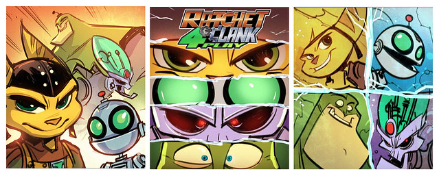
“Static Heroes.” This is the traditional, iconic movie-poster-style where you focus strongly on the characters’ faces. When it works, it’s because you know who they are. Note the game’s working title of “Ratchet & Clank: 4 Play,” which didn’t pass final approval for obvious reasons.
“Ready for Action.” This is your classic hero shot where the team is armed, ready for battle, and up against stiff odds. In these early comps, marvel at Qwark’s huge body and (understandably) tiny head — it was a constant design challenge to fit him into frame.

“Team Smackdown.” This is an approach often seen gracing comic book covers – say, part three of a five-part series. The heroes are in the throes of combat, in the middle of the destruction. For this to work, we have to show them working together: jumping into battle, rushing towards the screen, or firing their weapons.
Based on our early compositions, we quickly determined that the Team Smackdown approach looked too busy to be effective: it showed lot of weapon effects, enemies getting shredded, tons of motion, with some characters looking too small or disappearing in the chaos. Qwark alone took up to a third of the entire image in some of comps! The Static Heroes approach was tempting, and we’d used it for Tools of Destruction, but we walked away from it because you had to know who these characters are for the effect to work. And with All 4 One, we wanted to introduce the characters to a new generation of gamers in addition to longtime series fans.
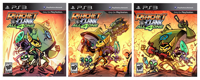
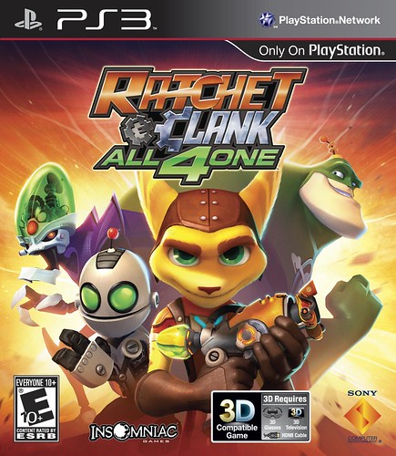
We took a step back and thought it might be smart to use the art more consistently, to try to communicate who the characters were through the art and then show it again and again. After kicking ideas back and forth, we settled into the next phase of the art design. We ultimately opted to focus on the Ready For Action theme, with a dash of Static Heroes by pulling the camera in close so you could identify the characters. From there it was a back-and-forth process of tweaking the thumbnail sketches until we got the effect we wanted.

As we made progress towards the final version, we gradually learned that it was best to show the characters from the waist up. Throughout this process, you have to consider so much: weapons can add a lot of clutter, but at the same time if we had left the characters empty-handed, people who saw the art might think it was a game where four guys punched everyone in the face — not what we wanted!
Throughout the entire process, our collaboration with Insomniac was an excellent experience. Insomniac Principle Artist Dave Guertin, took our suggestions and reworked the image until we hit the design goals of both teams. Our creative collaboration with Insomniac wasn’t just nodding and smiling – we were on the same page and we gave each other what we wanted.
This version is getting close, but we wanted Ratchet to sport a mischievous grin and instead he looks kind of… evil. We asked Dave to raise his head a bit and subtly brighten his eyes. We wanted him to look like he’s ready to kick butt, not like he’s going to kill you in your sleep!
Meanwhile, as we worked towards the final version, there were so many factors to keep in mind. You need to make room for the game’s logo to stand out (and it’s a big one!), so you have to be very economical and make smart design decisions. We also wanted to showcase the game’s weaponry — a key gameplay feature for the series since day one — so we slapped a Combuster into Ratchet’s hot little hands.
Once we were homing in on our final designs, we conducted an experiment to see how the art options would hold up in the real world. We headed down to our retail staging area, which has shelf mockups that mimic the ones you see various retailers. We smacked the artwork onto the shelf, and we immediately saw that a bar covered up both Ratchet and Clank’s faces. D’oh! So we had to creep the logo and artwork higher to keep them above that bar. It’s the little things…
Between concept, direction, approvals, renders, tests and internal reviews, the packfront design process lasted between seven and eight months of constant iteration and refinement. Dave painted the final image in February of 2011, just in time to debut it on the PlayStation.Blog a few weeks later.
And there you have it, our journey towards a final packfront. As you can see above, it can take a lot of time, effort, trial, error and discussion to get to the final piece that we reveal our gaming audience. It may seem easy when you take a glance, but it’s anything but.
We hope you enjoyed the read and found it educational. Let us know what some of your alternate favorites are below and be sure to pick up a copy of Ratchet & Clank: All 4 One when it releases this October 18th!
Comments are closed.
63 Comments
Loading More Comments