
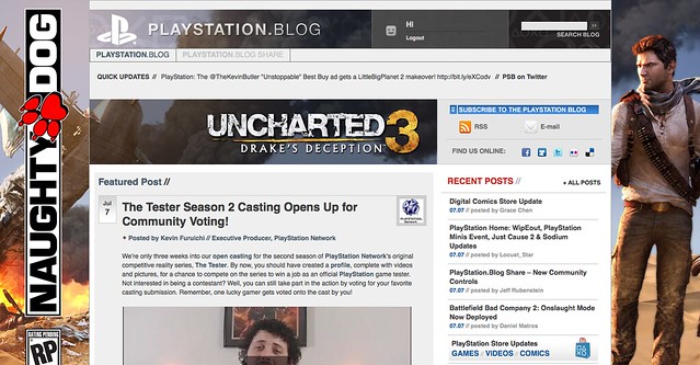
Today, we’re quite ecstatic to unveil the new look of the PlayStation.Blog. As the site marches towards its 4th anniversary in June, the patchwork, add-on look of these pages began to resemble the Weasley house. Also, we were tired of being unfavorably compared to our more attractive, cosmopolitan European sister site.
Unlike commercial sites, we didn’t redesign to serve you more ads, or because we have an in-house art staff that we have to justify. We redesigned the PlayStation.Blog with your requests in mind. How do we know what you’re looking for? You’ve been voting with your clicks.
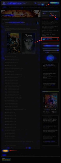
Over the past year, we’ve been analyzing where readers click on the site and, as you can see, items like PlayStation Store update posts and recent stories light up like a Christmas tree. If you only decorate your tree with white lights, that is. When we coupled this info with traffic patterns, Google searches, and other data, it was pretty clear what types of things Blog readers like yourself are looking for when you visit. This redesign addresses these needs.
So we’ve added prominent, permanent links to PlayStation Plus and PlayStation Home content. We’ve overhauled the search box with autocomplete. Our biggest recent releases now “live” at the top right of the site. And huge news won’t get pushed down the page nearly as quickly as it used to.
Conversely, with the old design many things weren’t as easy to find as they should have been. You’ll now find it easier to give feedback on posts via Twitter and Facebook (both of which had a fraction of their current userbase when we first launched the site). Related content will appear at the bottom of a post, and a string of features can be found in a scrolling “red box” belt right in the middle of the homepage.
We also know that the average reader owns a wider, higher-resolution monitor than when we first launched in 2007, and so we’re taking advantage of that additional real estate, and you can expect more and better takeovers of the site, like we did with UNCHARTED 3’s launch.
Now, we realize that this new design will take some getting used to, and some of you will probably hate it outright – at least at first. Many of you said as much when we inverted the color palette from black to white last year, though those complaints died out very quickly as we all adjusted.
Still, for those who really loved the old site, if you look closely, you’ll notice the things that *didn’t* change. The font, colors, and sizes are all the same. Comment replies remain an attention-grabbing red. Of course, the PlayStation news content you visit us to view will all still be here – you just won’t have to look as hard.
Over the course of the redesign process, we began to compare the new site to [lady with the hat]. Even if you don’t care for the flashy new hat, the old girl you know and love is still underneath.
Please let us know what you think. As always, we’ll be reading.
Sincerely,
Jeff, Sid, and Rey
Your PlayStation.Blog team


I likey!! Great job!
Let me just say that while I know they are trendy and hip, not everyone these days is surfing the web on an iPad.
I have a PC with a widescreen monitor. And thanks to the new design, rather than it taking up most of my screen, the new site is orientated so it’s in a small column right in the middle.
You have an instant fan in me Jeff. I liked it so much I decided to do my first website review on my Playstation fan site. The review is here http://playstationweekly.com/?p=854 Jeff, if you have the time, it would be great if you could leave a comment in the comment section of the review.
Here’s to the new and improved US Playstation Blog!
I like the new look .. it just take some time to get use to.
Yeah, I’ll have to get used to this. But it looks good.
PS – The meet-up was cool, except I was expecting some free stuff (well, besides the drinks). All in all, it was pretty great though. I was not expecting Uncharted 3 in 3D to be there. And Jeff, it was really nice seeing you in person.
I really like it better. I like how much more convenient it is; instead of going through one post at a time to find or read what I’m interested it, there’s more in one side-by-side. Good job. This is the second gaming sight I read with a good, smart redesign. (Kotaku was the first)
Nice work , i didn’t like the post’s being in boxes but overall it’s really good .
I likey. Looks pretty funky.
Also: I’d definitely like a section for PlayStation Store updates. Tried looking in the Games section in the top right, and in the New Releases down below, but all I found in either was The Drop. In checking just now, the updates are all in the PSN section from the bar at the top, but itd be nice to have a little section aboot ’em.
I like it overall but I keep getting
Maintenance
We’re making a few quick changes and the site will be back online in just a few moments.
when I’m at the front page of the blog. Obviously the blog is not under maintenance because I’m making this post right here and I can still view pages 2,3 and beyond but not the front page for some reason.
i hate this new look. it is cluttered and busy. you guys tried to do too much when the old look was much better and simpler.
bring back the old look please. this looks more like a store website than a blog.
looks more modern, that s good
i’ve haven’t been able to spend much time with the new design but i’m liking it. i’m also missing some of the old features like latest comment.
Not a big fan of the double-column setup. I use a laptop screen most of the time, which is not large enough to comfortably view both columns without feeling “cluttered”. I like having clean space on the edges of my page, just like when reading a book, it’s nice to have margins of empty space on either side of the page.
I’ll probably get used to it, but it would be nice if we could have an option for the classic look, or at least to keep it to 1 column (and keep everything else the new way), since that would be a simpler implementation.
This is awesome…I love the new look.
Looking real Fly!!!
Dear Jeff, Sid and Rey
Can you fix it so that if we click on “Replies” that it will only show those posts that you guys have replied to in red?
Or how about being able to jump to our own posts to see if anyone’s replied?
Finally (I know you’ve been receiving a ton of feature requests, most of us are not complaining, but we’d love to help you guys to make PS Blog even better) – is there any reason why we don’t have the same PSN user menu that they have over on us.playstation.com
On the official PlayStation site, clicking on your username brings up trophies, online friends, portable id, account settings, stuff like that. Seriously, this user menu should exist on every PlayStation site, including this one and the forum. Right now, the only way to access this menu is on the site that no-one visits. It’s a complete waste over there on the PlayStation main page, and I’m sure a lot of users don’t even know that it exist.
Put that menu on the forum and the blog, and you’ll get a load more people taking advantage of that functionality. You’d also get more traffic as people would come here to check their friends’ online status.
Also, something for you guys to communicate with the powers-that-be
Please try to get the PSN text messenger service that we have on the PS3 integrated into PlayStation sites like this blog and the forum.
People will love it. In order to avoid people setting up spam accounts, you can verify users by only giving the service to people with activated consoles, rather than everyone with a PSN account.
Or… [drumroll] …have web-based PSN messages as a perk for PlayStation Plus users :)
It would be another great reason to upgrade, and it would virtually eliminate the possibility of people spamming from the web
Ugh. Terrible color scheme, very unpleasant to look at. Fixed width instead of floating to fill browser. Obviously more concerned with superficial appearances than actually providing useful info in a convenient and easy to read format. Didn’t the Gawker debacle teach you web designers anything? Revert this Epic Fail and go read up on Jakob Nielsen. Not that the old site was much better, it was just better than this.
At first loading it seemed a bit cluttered and quite “POW!” right in your face…but after a few minutes I’m already getting used to it and know it will improve (as with anything PlayStation always has).
It’s a bit garish with the overuse of graphics, to the point that my eyes start to swim on the page.
This is Great! love it
I actually like the redesign. It’ll take a few days to get use to, but I think it’s a change for the better. I really like how you have PS3 / PSP / PSN / NGP all buttons in the upper right hand side of the page. Very nice.
All the stuff on screen is a bit much. I liked the simplicity of the old blog, but I’m sure I’ll get used to this.
You guys should really consider a better domain name that is easier to remember and type in. Like PlayStationBlog.com for example.
oh yea where’s the latest comments?
I would like to see a way to click on my name and see all the posts I have made. It would make thins much easier to find when you are waiting to see if anyone is oing to respond to your comment. Also a way to click someone’s PSN ID and then see their name if you are directing your comment at them specifically.
Oh and aging I ask,…Where is the Playstation Conversation located now? I can’t seem to find it. Thanks.
Ugh, sorry about all the typos…how about an edit button, too! :-D
I really dig the new layout. Yet, I feel the top is cluttered with too many blogs and is a bit repetitive when they are posted below. Why not One or Two Blogs then use a slide scroll instead for 4 small ones (with the slide scroll) and the 3 stationary blog post. Since the reader can scroll down to see them?
I never thought I’d say it but Sony blog it looking sexy. Grrrrrrr
I do like the over all look, but I’m with many posters in that it looks a little busy. Its nice to have a lot on the page, but its almost too much! I’m not one for artistic design, and I know its new so has plenty of room for tweaking, but I wouldn’t mind seeing perhaps a bit of a trim down on featured stuff, and maybe a bit more use of the side bars for recent articles?
I love it. I really like the red color scheme, and the new layout makes finding news posts much easier. Very sleek and sexy.
Yesterday when I went to this site I first thought that I clicked on the wrong link but then I saw this article about the new look you guys gave it. I’m usually not a fan of change but this isn’t too bad.
One question I have though is that I visited this site on my psp today and it looked just how it used to, then I reloaded the page and it all of a sudden turned into what it looks like now. It was almost impossible to use because of how slow it was. So I was just wondering if you were going to keep it the same old simple version for that or not?
Wow the right column now has a darker background. Good change but still a lot more is needed to make this functional again.
I like the new look and the scroller at the top to view the most recent posts. But the best feature is the abitily to filter posts by system, that’s awesome!
Still can’t login and reply on my ps3 . You think that would be a given that they would have made that work .
It’s really busy and hard to find stuff, IMO. I don’t like it.
will there be a new playstation widget and are you thinking about making a playstation blog app for iphone and android?
Please Reply.
I don’t like it. Too much color, too much happening, this site screams now, not easy on the eyes….
I’m still iffy on it; it feels extremely busy to me, and like a lot more work to find what is new.
Hate it. This is just as bad as the Gawker Media redesign. Did you guys ever wonder how you could simultaneously piss off a large number of your blog viewers? If not, you’ve inadvertently stumbled upon a sure fire method.
And since I just know you’re going to be as stubborn if not more so than the Gawker staff, I’ll just say this: I come here to read blog posts, not read the GDC wrap up, or see what new stuff you want me to squander my money on, or read about 3D, or watch the latest videos, or read about the move, so do us all a favor and remove that scroll bar directly below your highlighted post, and put it at the bottom of the page where it isn’t in the way.
LOVE IT!
I love hate it. LOVE how all the stuff is more organized and easier to scroll plus i LOVE how the comments were blown up bigger! Only thing i don’t like is that it’s new and unexpected x)
By the way could you guys raise the 1250 character limit? Having to trunicate my pertinent (not really) comments over and over again until they fit the cap is such a bother! Twelve hundred and fifty characters is an odd amount anyway. I realize Sony is somewhat stingy on giving out space (see: PS+ save file backup limit), but at least give this a bump up for fifteen hundred characters!
Yeah I agree most humans don’t like change, but I’m certainly digging this new look. I can’t wait until I fully get assimilated with the new look.
Dear PSB Team,
Hey I actually like it but I can’t find the playstation conversation thing from before ( the thing that says what you are reading and links us to external sites)
Dear PSB Team, The site looks awesome!I’ve seen both this and the Official PS site grown since the Underground days and youve come a long way. Compared to the previous PSBlog this version is overwhelming but when you put some sun glasses on you’ll notice that there’s twice the articles coming at you. Thats means i only gotta hit the “older articles” button maybe once, if that! Love the top right triangle, O , square, X ! Pretty nice though the sequence is of i think! Lol.Im really happy with the update, good work guys!
I love it!
+1 Sony!
hey … did you clean it up a bit ??? to be honest i think the ps3 browser was mucking it up a little looks even better .
Love the new look and feel! Much more appealing. Great job Sony!