


Notice anything different?
Today, we’re quite ecstatic to unveil the new look of the PlayStation.Blog. As the site marches towards its 4th anniversary in June, the patchwork, add-on look of these pages began to resemble the Weasley house. Also, we were tired of being unfavorably compared to our more attractive, cosmopolitan European sister site.
Unlike commercial sites, we didn’t redesign to serve you more ads, or because we have an in-house art staff that we have to justify. We redesigned the PlayStation.Blog with your requests in mind. How do we know what you’re looking for? You’ve been voting with your clicks.
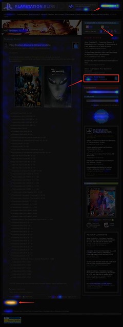
Over the past year, we’ve been analyzing where readers click on the site and, as you can see, items like PlayStation Store update posts and recent stories light up like a Christmas tree. If you only decorate your tree with white lights, that is. When we coupled this info with traffic patterns, Google searches, and other data, it was pretty clear what types of things Blog readers like yourself are looking for when you visit. This redesign addresses these needs.
So we’ve added prominent, permanent links to PlayStation Plus and PlayStation Home content. We’ve overhauled the search box with autocomplete. Our biggest recent releases now “live” at the top right of the site. And huge news won’t get pushed down the page nearly as quickly as it used to.
Conversely, with the old design many things weren’t as easy to find as they should have been. You’ll now find it easier to give feedback on posts via Twitter and Facebook (both of which had a fraction of their current userbase when we first launched the site). Related content will appear at the bottom of a post, and a string of features can be found in a scrolling “red box” belt right in the middle of the homepage.
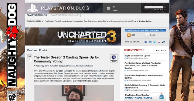
We also know that the average reader owns a wider, higher-resolution monitor than when we first launched in 2007, and so we’re taking advantage of that additional real estate, and you can expect more and better takeovers of the site, like we did with UNCHARTED 3’s launch.
Now, we realize that this new design will take some getting used to, and some of you will probably hate it outright – at least at first. Many of you said as much when we inverted the color palette from black to white last year, though those complaints died out very quickly as we all adjusted.
Still, for those who really loved the old site, if you look closely, you’ll notice the things that *didn’t* change. The font, colors, and sizes are all the same. Comment replies remain an attention-grabbing red. Of course, the PlayStation news content you visit us to view will all still be here – you just won’t have to look as hard.
Over the course of the redesign process, we began to compare the new site to [lady with the hat]. Even if you don’t care for the flashy new hat, the old girl you know and love is still underneath.
Please let us know what you think. As always, we’ll be reading.
Sincerely,
Jeff, Sid, and Rey
Your PlayStation.Blog team
I like the new design, especially the PS3/PSP/PSN/NGP tabs. Plus it looks nice on the iPod. I would like that PS app, though. :P
Pretty sexy, i like it
Glad to be European. I really like how it shows the entire content on the front page, and you only have to click on the next page if you missed some that day.
I really hate double clicking and REloading pages just to see I am reading something I was not interested in after all.
On the EU site, you just scroll ahead a bit more if you don’t like the content of the post. Here you have to REload the front page again (or close the new page).
I’ve rather one slightly longer page load then 5 of the faster ones.
I hope the EU blog doesn’t change it’s layout!
Looks snazzy, and it’s yet another thing that matches the red-and-black scheme of my DS Lite, my PSP, my phone, one of my work outfits, my sleeping/lounge clothes…
One big request from me, though: Announce/List PlayStation minis updates. Since those things don’t react to the Update or Automatic Download functions, nor do they show their version number through the PS3 (the PSP, or at least the regular one, still gives it, though), we have to rely on external sources (such as pspminis.com) to know when our little games have been upgraded (or just “patched”), like the recent A Space Shooter for 2 Bucks! and Mad Blocker Alpha updates. Having a reliable source to cover all the games of that section would be a big relief, if you can/are up to it.
I own a web design studio so I wanted to chime in on this discussion. I am really liking the new design and find it a suitable upgrade for the Playstation.com brand. I personally feel the new design better incorporates the homepage design style (quite the nice upgrade as well when it launched). Great work guys!
Keep it up!
Not IE6 friendly at all…. I really wish my company would upgrade the web browsers around here.
well as a designer i have to say the older is softer and has better reading, you can better see/read the content. the functionality is not bad, but you have to keep in mind that less is more. now you are showing a lot of content, that now its not just one column but has too many columns and rows, and colors are too heavy. and you are shooting lots of information to reader that really get suffocating. the older one has better spacing and is more fresh than this.
i recognize this development working, but we always have to think about the impact when we are gonna change something.
now i see the page as a small box we so much content in the center. instead the older one looks wider and you got information in a same column, and i also can see there are now some unnecessary elements.
thank for reading, and remember that i really appreciate your work. but those are my comments about.
take care everyone!
Hey Jeff love the new blog look. I have to get used to it cause there’s so much going on now but i like it a lot. Jeff how about giving us PS+ subs a little love by showing the yellow pad like in your sister site. well other than that keep up the good work guys.
wow i like it alot! lol at first i didnt think i was at the right site :P
I am just wondering where Playstation Conversation went? I looked at that everyday…
it would bw cool if you add neon color to PS controller symbols:
-Triangle: green
-Square – purple
and so on… at the top right
Very nice!
I like it. Is a similar update to the main Playstation site coming soon?
I like the design but it looks kinda clustered. Too much stuff happening.
Please hurry w/ that iPhone PS Blog app!!!!
Looks great, still easy to view. I like it.
it’s definitely going to take some time to get used to. I think it’s not bad but I wish you gave us the option to go back to the old way some how lol.
I LOVE IT!
Finally, a cool background instead of plain white everywhere. Red really suits it. You guys really outdid yourselves, Grats!!!
Looks good guys!
While I don’t think the old layout was bad, it’s nice to see it get freshened up every now and again.
Oh I like it! I will called: “Find everything with one click of a mouse”
What is it these day with blog site bloating it up this way! Keep it Simple Stu…
I love it! Thanks for listening to us and being involved with the community.
I cant think of any suggestions cause it all looks nice,but…just to throw a crazy idea out here; would you consider making a Home Space of the Playstation Blog? Then if you could incorporate both instances so we can post comments from home too within the 3D space. It sure would look fancy as this new site does :D
Just an idea, what do ya think?
It seems busy but I think I can get used to it. I like that its become easier to find PS Store, The Drop and PSPlus articles. I may miss clicking my bookmark and BAM being presented the latest article, but its a good trade off to be able to browse the last 4 or 5 articles above the fold immediately and having options to sort by platform. Keep up the good work.
i like it. It’s actually pretty radical and you should be congratulated for that. It would have been easy to have changed the color scheme or move content blocks around but you have made a bold change. Nice job.
Overall I like the new look. It does seem to be running a little bit slower than the old design did. I did like having the previous headlines in a list form than to this big block form.
On a side not All the headline text across the site only displays as outlines, which seems to be a Firefox 3.6 issue with that specific font (Helvetica Neue) on macs. They don’t seem to be trying to fix it, and Firefox is all I use on my work machine, so I won’t be checking the blog anymore at the office.
why the hate, i think it’s great, just takes some getting used to where all the features are
Well done: Jeff, Sid, and Rey
The blog design is good, and much better thought out than the forum redesign. Seriously, I’m used to the new blog after three minutes, but after three months I still don’t really like the new forum design.
The blog is just a tiny bit cluttered on the front page… would it be too much to ask for a button to flip between two columns and one column for the posts list at the bottom?
What I like:
– The grey/red colour scheme… matches my avatar!
– The tags for videos, comics etc at the top right. A simple way to filter out content
– The top login bar is very simple, in a good way
– It actually loads on my phone :D
The simplicity of the former design was very effective and as previous comments say, it looks very cluttered and I agree
It’s hideous. It really is. It’s so unorganized and just flat out ugly and unappealing. It’s not easy to navigate and fine the newest stories and it’s bulky and blah.
I vote for changing it back and you guys start over from scratch. Or hire new web designers.
What I don’t like:
– The page is loading a tiny bit slower than before, but it might just be me (Hong Kong internet connections are not so stable since last week’s earthquake in Japan, sometimes the site opens really fast, sometimes slow)
– Lack of “Plus” logo, but I know you said that it’s coming
– The login bar doesn’t have the dropdown menu. On us.playstation.com , clicking on our username calls up a dropdown list where we can see our online PSN friends, trophies, portable id, account settings, stuff like that. Really, this menu should be on all PlayStation sites.
– Very slow on my PS3 browser. Did anyone else have issues on the PS3? It takes a long time to get in, and the pictures take a long time to load. I’m struggling to even log in through the PS browser, let alone leave a comment, so I’m writing this on PC. Again, I’m not sure if this is my connection’s problem, but I expect that a PlayStation official website should work exceptionally well on the PlayStation browser on PlayStation hardware. If PlayStation sites don’t work on the browser then they should either change the browser or change the site code.
I love it. Everything seems to be more accessible as stated in the post and the design is very modern. It reminds me of a certain games news conglomerate that I also like. It will take getting used to but if we never change then progress can never be made. Good job PS team!
As others have said, there’s too much duplication for the news stories (blog posts). Some duplication is good on a website (to ensure users have different ways to get at important stuff), but we shouldn’t be seeing the same posts three times on the top page. Otherwise, it’s nice to see a change. If you can reduce the busyness and how crammed things seem (not enough “white space”) by getting rid of some of the duplication, that would certainly address some of the concerns.
so if you have time to redesign the playstation blog can you redesign the xmb f
Why is everything so red, it feels way to aggressive. The layout is pretty good and i hope it continues to change and evolve a bit more. but it should have kept the cool blue color scheme.
Oh and by the way, can we get an edit function Rey? It would be much appreciated.
What confuses me:
– The position of the ratings boxes. Can we have another one at the bottom of each post?
– The “Select a language” button. On my computer it doesn’t do anything
– No PlayStation Network status light. The EU PS Blog has one, why can’t we? [sad face :( ]
Still, overall I’m happy with what you’ve done with the place. The lady’s hat does look nice… it’s just still got the store label sticking out. I’m sure it’ll be perfect once you guys tie up a couple of loose ends
-A bit more cluttered.
-Too much crap on the front page. The double-column to the right with the redundant Blog news is unnecessary.
-As noted above, redundancy in some areas.
-A pointless change to make if it doesn’t work any better in the PS3 Web Browser (or you don’t plan on giving us a Blog App in the XMB).
Looking good, last time a video game website updated their look, it didn’t go so well (rhymes with Motaku). This worked out much better than that other case.
Looks different. Thought i pressed the wrong site! :D
I really like how there was more on the first page to see as well. Cant go wrong with more info.
I like it! :D This is absolutely brilliant!
Very nice guys, very nice, I’m sure it’s KB approved, him being the VP of Awesomesauce and everything!!! 8P 8)
I like it but ………. what with the “RED”. Theres to much of it. After a while I’m going get tired of look at this BLOG SITE. I like “BLUE” better. It would be whole a lot better if you let us choose the “THEME COLOR” of the blog. Other then that I like how it set up. Nice work!!!!
One quick thing I would suggest: slightly increase the amount of space between the boxes and see if you can round off the corners of the boxes as well. That would keep it from looking so grid-like.
The color change was something that wasn’t too bad to get used to, as everything was still in the same place. This is rather… radical. It looks a tad messy. Busy.
I like the new layout! Good job, Sony!
My comment on page two was ignored, not too surprised. The blog is great but lacks participation from Sony. It might as well just be a news site, because all staff ever do is reply to the easy questions. Questions that are already answered in the main blog post. The real questions are almost always ignored especially when it comes to the store or Plus info. Outside of the blogs about new games, most blogs have no or very little staff replies. Any plans to to change that?
At first I wasn’t sure how I felt about the new look, but I have to say that I like how the most recent posts are laid out. Also its nice to see my PS3 avatar over to the side like that. I’m also glad you guys kept the red for the replies. Thats very handy. Overall, I think its going to be a good change.
I usually check the blog in a reader. Though this design, while a bit simple, is very nice.
I like it… But it’s a bit too slow to load.
I remember when the 5 star rating was introduced to the PS store. i said that most people tend to click 5 stars or 1 and it looks like i was right!
Looks pretty sweet, great job!